Introduction
Typography is more than just arranging letters—it is an art form that shapes the way we perceive and interact with text. Typeface mastery transforms simple text into a powerful communication tool, playing a crucial role in branding, readability, and user engagement.
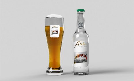
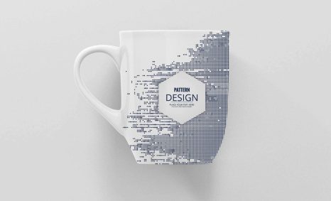
Unleashing the artistry of typeface mastery allows designers to convey messages with elegance and precision. The nuances of font selection can dramatically impact the aesthetics and readability of bi-fold brochures, making it essential for creators to explore an array of styles and techniques. To elevate your designs, consider utilizing valuable resources, such as bi-fold brochure mockup resources, which can help you visualize your creative concepts.
The Art and Science of Typeface Design
Typeface design blends artistic creativity with scientific precision. A master type designer considers aesthetics and functionality, ensuring each character is visually appealing and harmonious with the text as a whole.
- Emphasizes readability and legibility
- Enhances brand identity through unique custom designs
- Balances traditional practices with modern technology
The Impact of Typography on Branding
Typography is a cornerstone of brand identity. Choosing the right typeface can convey the essence of a brand, influencing consumer perception and creating emotional connections.
- Consistent typography reinforces brand recognition
- Custom fonts differentiate brands in competitive markets
- Expresses brand personality and values
Typefaces in Digital Media
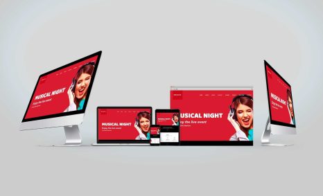
The digital era has transformed typography, expanding its role and reach. Responsive designs require typefaces that adapt to different screens and devices without losing clarity or intent.
- Facilitates seamless reading experiences across platforms
- Uses web fonts to enhance access and download speeds
- Employs variable fonts for increased flexibility and performance
Key Differences: Serif vs. Sans Serif
| Feature | Serif | Sans Serif |
|---|---|---|
| Design | Traditional with decorative edges or “serifs” | Modern and streamlined without serifs |
| Usage | Print media, reputable institutions | Digital media, technology companies |
| Impression | Formal, classic | Informal, contemporary |
| Readability | Clear in long-form print text | Effective in digital and short-form text |
Which Typeface Should You Use?
Choosing a typeface depends on the medium and message. For printed material, serif fonts often offer greater readability, while sans serif fonts excel in digital formats. Consider your brand’s voice and the context in which the typeface will appear.
FAQ
Why is typography important in design?
Typography is crucial as it impacts readability, conveys mood, and strengthens branding, enhancing overall communication.
What makes a good typeface?
A good typeface is legible, versatile, and tailored to its intended purpose, adding aesthetic value and readability.
How do custom fonts benefit businesses?
Custom fonts create a unique visual identity, enhance brand differentiation, and foster a stronger emotional connection with consumers.
Are serif fonts better for books and lengthy articles?
Yes, serif fonts traditionally improve readability in print due to their classic design, guiding the eye across lines of text more fluidly.
How can typography influence digital user experience?
Typography in digital media affects navigation, reading comfort, and engagement, making intuitive font choices essential for user-friendly interfaces.
What role does technology play in type design today?
Technology facilitates innovative type design, offering tools for creating variable fonts and adapting typography for diverse modern media formats.
Conclusion
Typeface mastery is an intricate blend of art and functionality, vital for effective communication in both print and digital media. The choice of typography can profoundly influence brand perception, readability, and user interaction. By understanding and harnessing this craft, designers can elevate content, craft memorable brand identities, and enhance the user experience.