If you design posters, prints, or wall art, you know the feeling. The design looks great in your editor, then falls flat the moment you show it to someone else. A poster mockup fixes that. It puts your work on a wall, in a frame, or in a real room, so people see it the way it is meant to be seen.
But “poster mockup” covers a lot of ground, and the wrong one can make good work look cheap. This guide breaks down the main types, when to use each, what separates a good mockup from a bad one, and how to pick the right scene for your design.
What a poster mockup actually is
A poster mockup is a template, usually a layered Photoshop file, that shows your design in a realistic setting. Most are built around a smart object, which is a placeholder layer you drop your artwork into. The file wraps your design onto the poster, matches the light and angle of the scene, and gives you a finished image in seconds.
The good ones do the hard work for you. Perspective, shadows, reflections, and lighting are already built in. You supply the art. That is the appeal. One file can present a hundred different designs, and each one comes out looking like a real photo.
The main types of poster mockups
Not every mockup does the same job. These are the ones worth knowing.
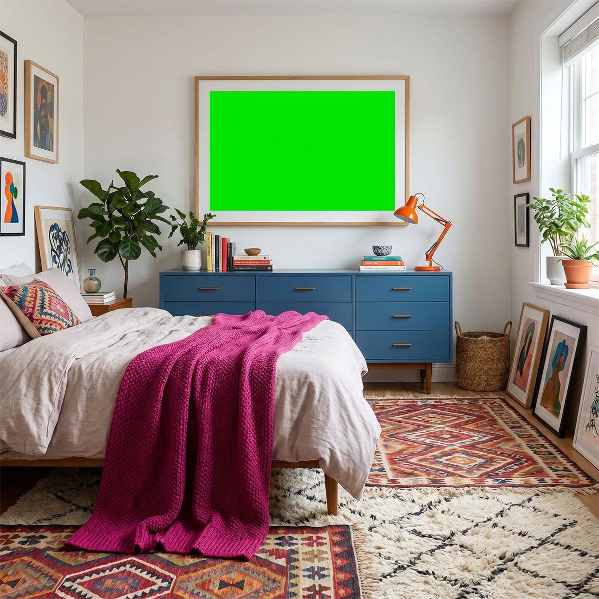
Scene or room mockups place the poster in a real interior, on a wall, above a sofa or a bed. They sell the feeling of owning the piece, which makes them the strongest choice for art, prints, and anything a person hangs at home.
Frame mockups focus tightly on a framed poster, often on a plain or textured wall. They are clean and flexible, good for portfolios and shops where you want the art to lead without a busy room around it.
Flat-lay mockups show the poster from above, sometimes with props like brushes, plants, or a phone. They suit social media and a casual, creative feel.
Isolated or wall mockups show the poster alone on a simple surface with a soft shadow. They are neutral and quick, useful when you need a plain, professional preview.
Hanging and rolled mockups show the poster gripped in a wooden hanger or partly rolled. They add a handmade, boutique look that fits print shops and stationery brands.
Outdoor and billboard mockups scale a poster up to a street or a large wall. These are for advertising and campaign work, not home prints.
When to use each one
Match the mockup to where the image will live.
For an Etsy or print-on-demand listing, lead with a scene mockup so buyers picture the art in a home, then back it up with a clean frame shot. For a client proof, a frame or isolated mockup keeps the focus on the design without distraction. For a portfolio, mix a strong room scene with a tidy frame view. For social media, a flat-lay or a warm room scene tends to stop the scroll. For a campaign, outdoor mockups show the poster at real-world scale.
The rule is simple. The more you want someone to feel ownership, the more you want a real room.
What separates a good poster mockup from a bad one
Free or paid, a mockup is only worth using if it holds up. Check these before you commit to one.
Resolution and detail. A sharp, high-resolution file reads as professional. A soft or pixelated one drags your design down with it.
A real smart object. You should be able to drop your art in once and have it map cleanly onto the poster, angle and all. If you have to warp it by hand, the file was built lazily.
Believable light and shadow. The best sign of a quality mockup is that you stop noticing it is a mockup. Light on the poster should match the light in the room, and the shadow should fall the right way.
Correct scale. A poster should sit at a believable size for the wall it is on. Scale that is slightly off is the thing viewers feel even when they cannot explain it.
A clear licence. Before you use a mockup for client or commercial work, confirm the terms. Plenty of free mockups are cleared for commercial use, but always check the source so you are covered.
How to choose the right scene for your poster
When you go with a room or scene mockup, the room does half the selling. Pick it to match the art and the buyer.
Calm, personal pieces, soft line art, muted colour, gentle type, belong in a bedroom scene, where the mood is restful and intimate. Bold, graphic work earns a living-room mockup above a sofa, the wall people actually gather around. Clean, modern, typographic designs look sharpest in a minimal room with room to breathe. And premium or limited pieces earn their price in a luxury interior, where the setting signals value before the buyer sees the number.
Same poster, right room, and the whole thing reads as more considered.
Common mistakes to avoid
A few small errors undo an otherwise good mockup.
Using one scene for everything. A single generic room makes your shop look flat and interchangeable.
Ignoring colour and light. Pasting a cool-toned design into a warm room, or the reverse, makes the art look stuck on.
Overcrowding the scene. Too many props pull attention away from the poster, which is the one thing you are actually selling.
Forgetting the plain shot. Buyers still want to see the design straight on and true to colour. Give them at least one clean view.
FAQ
What file format are poster mockups? Most are layered PSD files built for Photoshop, using smart objects for easy editing. Some come in other formats, but PSD with a smart object is the standard.
Can I use free poster mockups commercially? Often yes, but it depends on the licence. Many free mockups allow commercial use, sometimes with no attribution. Always confirm the terms on the source before using one for a client.
Do I need Photoshop to use them? For PSD smart-object files, yes, or an editor that supports PSD smart objects. Once you have done it once, swapping in a new design takes a minute.
How many mockups should I use per listing? Three is a good baseline: a room scene for feeling, a straight-on view for true colour, and one shot that shows scale.
Where to start
If you want a shortcut, skip building scenes from scratch and start with ready-made ones. Open a free poster mockup library, pick a room that fits your design, and drop your art in. You will have a finished, professional-looking image in minutes, and your poster will finally look the way you meant it to.