Graphic design is an essential aspect of branding and communication in today’s digital age. Whether you’re a seasoned designer or a novice, it’s easy to fall into certain traps that can undermine your work. Understanding common graphic design mistakes is crucial for improving your skills and creating visually appealing designs. This article explores ten frequent missteps that designers should avoid, ensuring your projects maintain a professional edge.
Graphic design is a powerful tool for communication, but even the most creative ideas can fall flat due to common mistakes. Understanding these pitfalls—such as poor typography, lack of contrast, or overwhelming visuals—can significantly elevate your design work. For those looking to enhance their projects, view our free mug templates to inspire your creativity.
1. Ignoring the Importance of Typography
Typography plays a pivotal role in graphic design, significantly influencing how viewers perceive your message. Common typography mistakes include:
- Using too many fonts: Limit yourself to two or three complementary typefaces.
- Poor font choices: Avoid overly decorative fonts that hinder readability.
- Neglecting hierarchy: Use size, weight, and spacing to establish a clear textual hierarchy.
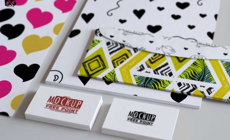
2. Overloading Visual Elements
In an attempt to create attention-grabbing designs, designers often crowd their layouts with too many images or text elements, resulting in overwhelming visuals. Instead:
- Prioritize white space to allow your design to breathe.
- Use fewer elements to create a cleaner, more focused visual.
- Ensure balance by distributing elements evenly across the design.
3. Poor Color Choices
Color selection can make or break a design. Some common pitfalls include:
| Mistake | Impact |
|---|---|
| Using too many colors | Can distract and confuse the viewer. |
| Ignoring color theory | Leads to clashing colors or poor contrast. |
| Neglecting accessibility | Can alienate users with color blindness. |
To avoid these issues, consider the following tips:
- Stick to a color palette that complements your brand.
- Utilize tools like Adobe Color to create harmonious color schemes.
- Test your designs for color accessibility.
4. Lack of Consistency
Inconsistency in design elements can create confusion and diminish the overall quality of your work. Here are key areas to maintain consistency:
- Color scheme
- Typography
- Layout and spacing
To ensure consistency, develop a style guide that outlines your design standards and stick to it throughout your projects.
5. Failing to Consider the Target Audience
Every design should cater to its intended audience. Ignoring user preferences can lead to designs that miss the mark. To align your work with audience expectations, consider:
- Conducting surveys or research to understand user preferences.
- Analyzing similar designs that resonate with your target demographic.
- Adapting your design style to fit cultural or contextual norms.
6. Neglecting Alignment
Alignment is crucial for creating cohesive and professional-looking designs. Misaligned elements can disrupt the flow and affect comprehension. To improve alignment:
- Utilize grids to organize your layout.
- Align text and graphics carefully.
- Consider the visual flow of your design to guide the viewer’s eye.
7. Using Low-Quality Images
Pixelated or poorly cropped images can detract from the professionalism of your design. Always opt for high-resolution visuals. Tips for selecting the right images include:
- Use stock photos from reputable sites or invest in custom photography.
- Ensure images are optimized for the web without sacrificing quality.
- Consider vector graphics for scalability without loss of quality.
8. Ignoring Feedback
Receiving constructive criticism can be invaluable for growth as a designer. Ignoring feedback can lead to stagnation in your skills. To incorporate feedback effectively:
- Seek input from peers and clients early in the design process.
- Be open to making changes based on constructive criticism.
- Use feedback as a learning opportunity to refine your technique.
9. Forgetting About User Experience
Design is not just about aesthetics; it also involves functionality. Neglecting user experience (UX) can lead to designs that are visually appealing but impractical. To enhance UX:
- Prioritize usability in interactive designs.
- Conduct usability testing to identify areas for improvement.
- Incorporate intuitive navigation and layout.
10. Skipping the Revision Process
Rushing to finalize a design often leads to oversight of mistakes and missed opportunities for improvement. Always allocate time for revisions by:
- Reviewing your work multiple times before submission.
- Seeking fresh eyes to catch errors you may have missed.
- Allowing time for feedback to be incorporated into the final design.
Conclusion
Avoiding these common graphic design mistakes can elevate the quality of your work and enhance your reputation as a designer. By paying attention to typography, color theory, user experience, and the importance of feedback, your designs will not only look good but also communicate your intended message effectively. Keep refining your skills, and your designs will surely stand out in a crowded market.
FAQ
What are the common graphic design mistakes to avoid?
Some common graphic design mistakes include poor font choices, lack of alignment, overuse of colors, ignoring white space, and using low-quality images.
How can I improve my graphic design skills?
To improve your graphic design skills, practice regularly, study design principles, seek feedback, and stay updated with design trends.
What is the importance of white space in graphic design?
White space, or negative space, is crucial in graphic design as it enhances readability, creates emphasis, and improves overall aesthetics.
How do I choose the right color palette for my design?
Choosing the right color palette involves understanding color theory, considering your audience, and ensuring harmony and contrast in your designs.
What role does typography play in graphic design?
Typography is vital in graphic design as it conveys the message, establishes hierarchy, and affects the overall tone of the design.
Why is it important to use high-quality images in graphic design?
High-quality images are essential in graphic design because they enhance visual appeal, maintain professionalism, and ensure clarity in your designs.